

How to choose the right background color during product photography
Author: Jeery
Date Created: 2023-03-15 20:20
While post-production is essential, quality product photography starts with your product shots. In this article, we'll learn how to make the most of your pictures by choosing the right colors for your background. We'll also share some best practices to help your product photos look great at the finish line and be ready for your customers to ooh and ahh.
WHY COLOR IS IMPORTANT?
Photos are your opportunity to showcase your products and tell your brand story. What better way to evoke the right mood and feel than to use color? Color can make an otherwise ordinary product pop off the page.
According to one survey, over three-quarters of online shoppers believe product photos strongly influence their purchasing decisions. Putting product photos together with unblended background colors can put you at a disadvantage.
Not only does color help showcase your products more clearly on the web and in catalogs, but it also subconsciously affects people's emotions.
Color is one of the most powerful tools for expressing emotion. Studies of unconscious bodily responses such as eye movements, brain activity, and heart rate have shown that when we see colors, they trigger very rapid and strong reactions. Colors communicate with us on an unconscious and non-verbal level.
Using color strategically, you can evoke the emotions you want shoppers to feel when interacting with your brand and products. While often an afterthought in marketing and business, color can go a long way in influencing your customers and ultimately play a role in their relationship with you and your brand.
The right color combination can help you highlight your product's features, and the right color background can bring your product to life. According to a study conducted by the Seoul International Color Expo, 92.6% of respondents cited visual factors as the most crucial factor when purchasing a product.
In addition, 22% of returns were because the product looked different from the photo. The colors you choose for a shoot are not just there to make your products look good-they show shoppers precisely what they expect from their order.
Understanding color's role allows you to make the right decisions for your shoot, but how do you choose the right background for your product photos? It depends on a variety of factors.
WHAT BACKGROUND COLOR DO YOU NEED FOR YOUR PRODUCT SHOOT?
One of the most important things to consider when deciding on a background color is the color of your product. Some colors work well with other colors, while others do not.
Before you shoot, confirm with your team which products you are capturing - make a shot list to help - and take an hour or so to review each product color. You may try multiple backgrounds throughout the shoot if you have multiple product colors.
A white background is a "safe" choice, but there are some drawbacks, which we'll discuss below. Light or neutral colors also work for most products.
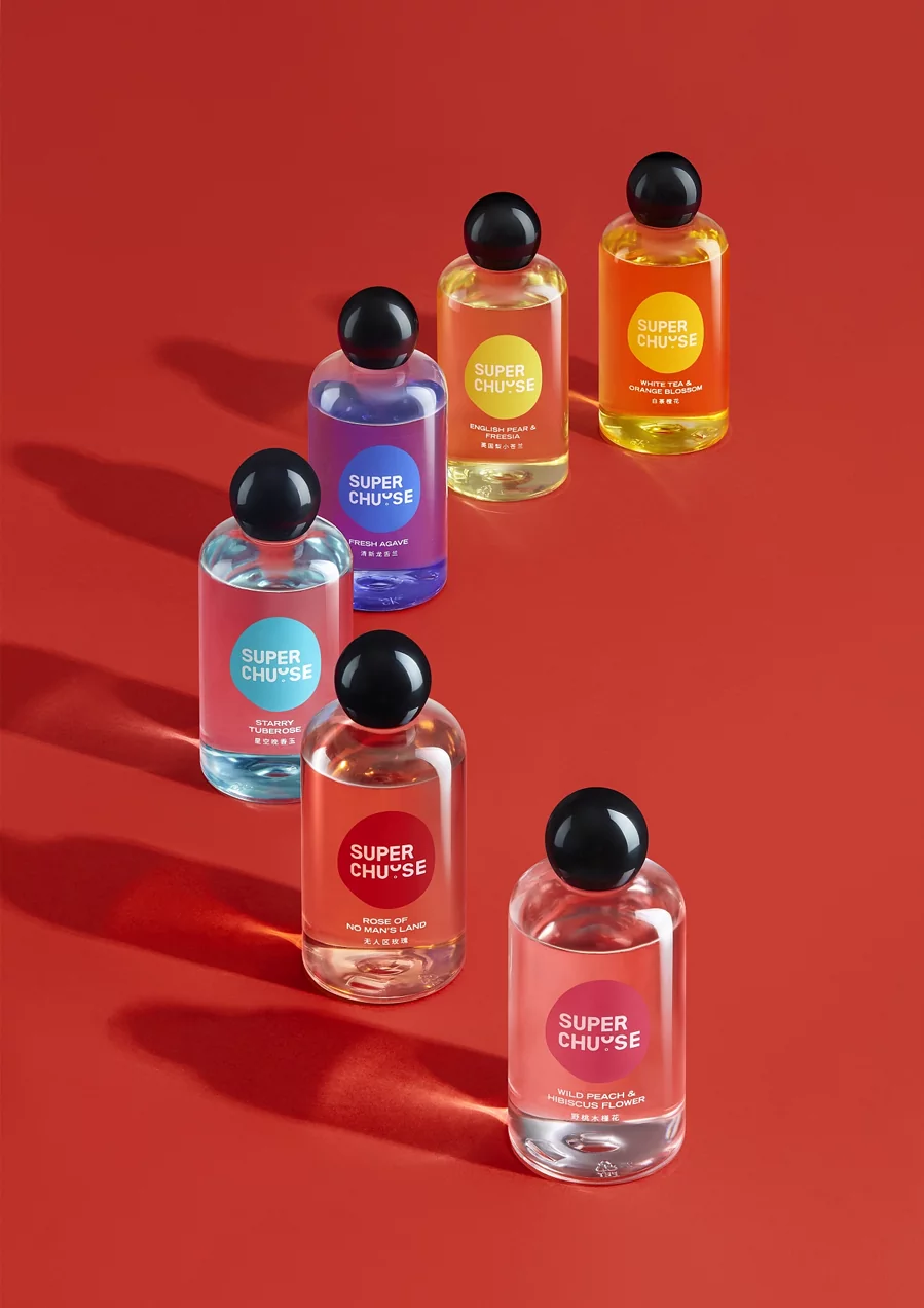
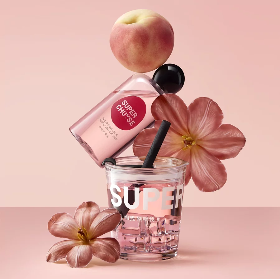
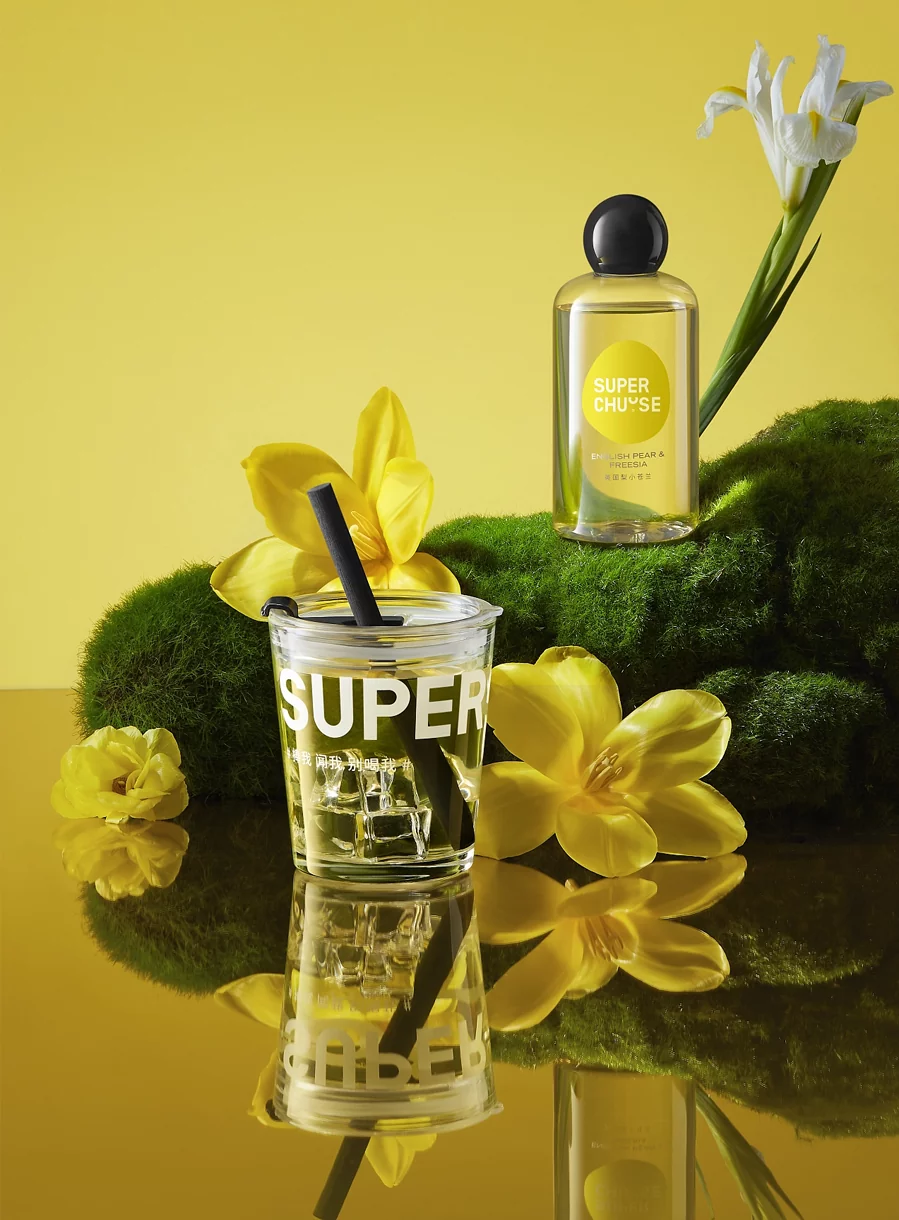
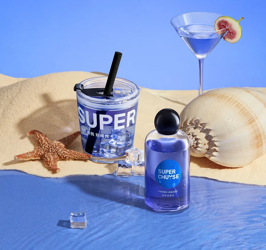
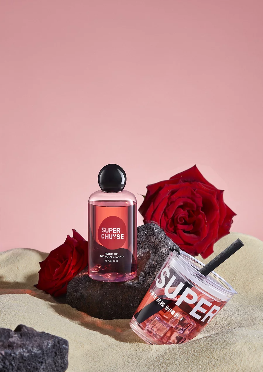
If you shoot products with many warm tones, an excellent background can help the project stand out. Using a spare set and dark products (and vice versa) will give your images a lot of contrast, which is especially useful when shooting product images for your website. Matching products and backgrounds with similar tones will produce calmer, more nuanced images that look more polished but less poppy.

Whichever background color you choose, you want to be able to see your products. If the background dulls the effect or makes it difficult to know, it's a clear sign that you'll want to try something different.
Other considerations when choosing colors for product backgrounds
While product color may significantly impact which color background you should use during your shoot, several other factors must be considered.
Model vs. no model
More than half of the top fashion sites use people in their product photos - and most use a combination of pure backgrounds and lifestyle product photography. Models can further enhance your product photos by showing how they look. If you plan to use models during your shoot, it's crucial to consider the model's hair, clothing, and skin tone.
Keep in mind that models play an essential role in highlighting your products. However, in most cases, they should not be the main focus.
Take the time to work with your team and photographer to think about how your model's hair, clothing, and skin tone will work with your background colors to make your product shine. Please determine in advance who your model is and which background colors you would like to use.
Also, it's helpful to create multiple looks and themes before your shoot so you know what to expect. Working with a stylist also helps ensure that your models and products complement each other. If you want your models to be the focus of your shoot, consider using less "flashy" colors to keep the focus on them. Make sure your models wear manageable clothes - solid colors are best - and the photos are taken against a less busy backdrop.
Sometimes models need more than a solid background for a shoot. Lifestyle photography can also have contextual environments, so it's essential to consider what colors will be present.
WHAT COLORS ARE BEST FOR YOUR PRODUCT BACKGROUNDS?
While there are many "best practices" to help choose the right colors, not all products (and backgrounds) are created equal. Rely on your photographer's guidance and shoot with several options to avoid wasting a day of shooting.
When you want to add color to your background, consider how those colors affect online shoppers. Do they complement the colors of your product and brand? Will they convince shoppers to buy? Do they resonate with your brand? You may also need to add color to the background of white or transparent products.
For example, in North American culture, "blue gives a sense of trust and stimulates appetite. Green is said to mean nature, freshness, growth, and money. Yellow brings sunshine and joy."
While color is necessary, the truth is that there is no "best color." The colors you choose depend on what you are trying to communicate through your product photos. This requires some strategic planning before the shoot.
The CXL Institute points out in their study on button color for conversion rates, "The button color itself has little to no impact. What matters more is how it changes the visual hierarchy of the page and how it makes the call-to-action phrase stand out."
Ultimately, whether it's portraiture or product photography - or anything in between - always consider the photo's subject and how it will make the viewer feel, whether alone or in the context of a frame. It must be effective with the issue.
SHOULD YOU USE A WHITE BACKGROUND?
By default, white is the most common background color, and for a good reason. It works with most color combinations and does not require extensive editing. In short, it's a safe bet.
In addition, many e-commerce marketplaces, such as Amazon, require at least one product photo with a white background. Therefore, it makes sense to combine multiple background colors when shooting.
If you want the product to be the photo star or need the image for a design that contains many ideas or text (such as a website or email), using a white/light neutral background color helps make the result look cleaner. This is a safer choice if the image's display size is relatively small. In addition, many colors in an image will create a larger file size. If you are concerned about the loading time of your site, a white background may help reduce the total amount of data.


